
HHD (Happy Hump Day) to all! On Monday I shared with you a super fun card using the Tropical Escape Bundle from the Annual Catalog (page 121) and today I have another clean and classic one to make you take a deep breath and sigh with a smile!
I admit, when I first saw this bundle in the catalog I thought – hmmm…..I do not know and I actually waited a wee bit before hitting that button and having it come to Randall Lane! What was the turning point for me to hit that button???….
The samples in the catalog and the gorgeous font
Yep, that’s the truth and I just was itchin’ to try try the card that I CASED today! On Monday I used bolder colors and it looked great and today I switched it up using softer tones and yep, I think it looks great again…what do you think? I did use the Tropical Textures DSP Stack for today (as I adore these colors and designs) but keep reading as I have other thoughts for you regarding colors.

I also want you to think about this…in all reality we can make a card ANY color we want as many time….our cards are from a “total imaginary card land”…and wouldn’t this be yummy with Navy, Sahara Sand and White – this would also be a SUPER way to use up DSP that is a pretty busy print and then take the colors from the DSP to tone it down…I just that what I am trying to say is, there are so many options…just do not limit yourself to certain colors!
Here is another great idea….with the BONUS DAYS being this month, You could grab this bundle and this DSP Stack – (that would = $55.00 and then you will get a $5.00 off for next month). As always, all of the products I am using today will be at the end of this blog post in the line up!

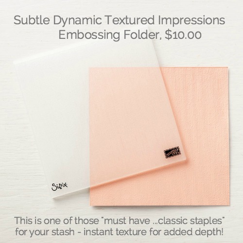
One thing that I have shared many time is…I forget to use Embossing Folders on a regular basis and that is SIMPLY SILLY as these gems have a BIG CREATE WOW FACTOR with minimal effort and the price point it BINGO…..heck – you could get this bundle and this embossing folder (that would = $54.00 and you would see be at that “sweet spot” to get the $5.00 off for next month)
Take a look at the below picture and I want to point out to you how I used this embossing folder. In a nut shell, I ran it through Mr. BIG twice…rotating the direction of the paper to give it a super soft and doubly textured (in both directions) cardstock that truly makes it feel like linen.
Look right under the watermark and you will see it. It is just amazing and it also stays so subtle and you can clearly see how flat a layering piece of paper will adhere to it. I point that out as I tend to get a bit grumpy when paper does not lay super flat!!!


I also used the Multipurpose Adhesive Sheets to adhere the die cut tropical-like square image to the piece of Shaded Spruce. Here is another tip that is pretty nifty about this particular die…You can basically make this any size as the “cut size” will be whatever the size of paper you are using. For today, I just used a piece of 3 1/2″ X 3 1/2″ square of Soft Sea Foam and then it was a cinch to adhere it to the piece of Shaded Spruce as the adhesive was already on!
Remember, I am offering the Adhesive Sheets and also a very delicate and detailed die with the adhesive already on so you can see how easy it is to just “peel off” the release sheet and then use it right away as there will be no sticky fingers and/or oozing adhesive this month for my gift with purchase.

I have a question for you as I am just giddy about this card. It is just one of those “sunshine and smiles” cards for me when I see it…
Doesn’t basic shapes and layers of paper just add so much?
In the below picture I wanted to point out the fun envelope. I do love my envies! For this one….I really wanted to have fun and play up the color with the card so this time I used a 1/2″ strip of the pink (also with the texturing from the embossing folder) and then a sliver of the Soft Sea Foam along with the DSP. Yep, it does take a wee bit more time to do but there is no doubt that the end result is worth it!

There really is not much to the layout of this card, just a simple use of the basics that I love and use so much.There is one thing that I wanted to share but it is totally no imperative to do….
I am just lovin’ the new stamp pads as they truly do give you such a clean, crisp and solid image and because I never put away my clear embossing powder from the other day I thought – what the heck….go ahead and sprinkle some clear embossing powder over top of the stamped sentiment and heat set it.
There is just nothing like the look and feel of an embossed sentiment, truly the icing on the cake. I think that it make the sentiment even stand out more enhancing the meaning!

That’s all I have for you today….but I think that it is one of those “keepers” that I just love to make. Colors and layers make such an impact with such a little effort. We all seem to get in moods gravitating to certain colors but I invite you to challenge yourself any go out of the “standard box” we tend to get into and try the idea I said with using DSP that we have around.
The one thing that I think that we all seem to know is that Stampin’ Up! does a fantastic job in the color coordination across the entire line. From cardstock to DSP….the inks…to the ribbon offerings, we always know that they will match. That in itself is a godsend not having to worry about “is this going to match”
Have a wonderful HUMP DAY and I will see you on Friday with the offerings I have for you in another Product Shares showcasing the upcoming new Holiday Catalog!
I will be offering a couple of things from the last one as I have had requests for them. Products are the BEST WAY to get a taste without breaking your Daisy bank….speaking of Miss Daisy, she is a bit grumpy with the heat the East Coast is having!


Hi Susan, yes this is a great card. Always love your details.
?
Thanks Nancy… You know that I love to share those little tips and Tidbits as imthink those are the things that take our cards to the next level! Have a wonderful day…
I think Daisy and I are in the same boat! I’m tired of the heat too, bring on the autumn temps! ?
I could not agree with you more… By far – fall is my favorite season of the year! I too am looking forward to cooler days and lower humidity… Poor Daisey!
Gorgeous card Susan! Fantastic layers and beautiful color palette. Genius idea to run that embossing folder in both directions!
Thanks Dana… We all know how layers can really make that added touch! This embossing folder is absolutely wonderful. Actually… I’m glad it’s an embossing folder and not a stamp with the linen look as I think the texture is just stunning!
Hi Susan, Such a beautiful card. The subtle embossing folder
is my new favorite! Have a great day.
I couldn’t agree with you more… I think it’s one of those products that people have to try …and see the texture that it gives to a project.
I’ve vowed to myself to remember to try to remember to use embossing folders more and I do so for a while and then I forget!
Silly Susan… Embossing folders are so inexpensive and they give such a huge wow!
Yes, layers make all the difference. I use to try and follow along with the MOJO Monday challenge for that reason. It always had layers. This is a gorgeous card. Although I haven’t made many things using the “Soft Sea Foam” green, it is one of my favorites.
First… I am so glad to hear you loving and enjoying the benefits of playing along with challenges. I am a firm believer that creating from a guideline of a sketch or certain elements really helps your creativity jumpstart!
I am totally with you as well on the soft sea foam color… I think it is a lovely color yet I have not used it a bunch. I thought it worked perfectly with this card!
Love the layers, details and the embossing folder of this card, Susan. So pretty! I’m looking forward to your paper shares on Friday. Enjoy your day!
Hello my Delaware friend… Thanks for popping in! Yep, when there is a new catalog we have to have those products shares… I totally get it! I hope you are surviving through this heat and humidity…
Gorgeous color palette..soft and soothing. Your card is simply beautiful! Hugs.
Thanks Mary Ann… You know how I love to use the catalog ideas for inspiration and I truly suggest that everyone tries that!
I thought of you the other day as my daughter is in England…she sent me the funniest video of a bunch of sheep she stumbled onto while on a run….I bet I’ve watched it five times and every time I watch it I think of you!
Sheep rock…Mary Ann rocks!
I’m with you~my initial reaction to this suite was, “Do I REALLY need this?” because it’s a lot like Botanical set from SAB a couple years ago (which I kept and use a lot) but you’re right: the font sold me. And then I just HAD to have the paper…! I love the two different looks you achieved with the same basic materials but different color schemes between today’s card and the one from the other day. And today’s envelope is awesome!
So glad you’re blogging regularly; it’s such a joy to see a post from you. Thanks for sharing!
Now Lynda… You know what I’m going to say! I totally agree with you…
I also had that same stamp said that you’re referring to… I really think that this is why I was holding back on this bundle! However, I’m thrilled that I purchased this bundle as it is not only much easier to work with because of the size of the stamps and Framelits….but those sentiments and fonts are just fabulous!
That coordinating DSP is just lovely… I love how Stampin Up offers a basic print on the flipside that you could really use all year round…
I love love this suite and I have used the retired Botanicals and also some Paper Pumpkin extras . Such fun and there are a boatload of colors that I have found that go together with these . This card is a SUSAN STYLE that I just love . It is all in the details !! The first thing I noticed was that “sliver” of Seafoam cs on your envelope ….yep, that is a Susan !!
I have that Subtle on my next order . Just got the Tufted !
Guess I had better go get some new SCRATCH OFF Tix since it`s Product Shares time …..Giggle !!
Hello my North Carolina friend. I hope that you were staying inside the air conditioning and crafting your little heart away!
As I have said I was on the fence with this bundle and you know I am always honest about my thoughts and feelings about products… But I admit, I’m thrilled that I purchased it.
I cannot tell you how many times I think of you whenever I see lottery advertisements… I hope that you win it big my friend!
OK I can’t get my comments to stay. So, I will keep this short as I am tired of retyping. Love the card and the envelope is the best! Looking forward to the shares!!!! Note I will change my Chris R. from Iowa to see if the “Comment Gods” like it better.
Oh no… What are we going to do as first you’ve had computer problems now you’re having comment problems!
I say you should turn off your computer and let it go to sleep for a couple hours and then restart it and hopefully magic will happen! It’s probably super tired from you pressing all the buttons!
Many thanks for popping in the house… I now see yours comments say Chris from Pella instead of Chris Rfrom Iowa… Hopefully blog readers have picked that up our one and only Chris is still in the house!
Hot dog, it worked (my comment)! While Sonny is getting some new scratch off tickets I am taking one of my piggy banks to the bank tomorrow and cashing it in! I think I might have better luck!
Do it!!!! You of all people could win it big and the we could go to that “fair of yours “ and have a big time!
Today, Sunday, is the last day of the fair. We did not go at all this year. You would have loved Mike complete with a gold t shirt and his denim overalls. He had his big floppy hat on while he again spent another day trying to cut away more of the tree stump that was already chipped down. The soil shifted during the winter after the concrete work so he decided he had to cut it down another foot or so. He has gone through at least five chains for the chainsaw. Anyway, my minion husband can now get on with life!!!