
YIPPEE – the weekend and WE ARE M E L T I N G…this crazy weather – this time last week 36+ inches of snow and the forecast for Monday is to be 62 degrees – CRAZY!!!!
Why did I say this is a “subtle” Simple Saturday = EASY…..the colors of ink I used today are all from the subtles collection…they are Blushing Bride, So Saffron and Pear Pizzazz!
I must toot my horn, I really like this card…I had no clue what to do with you (and I shared with you that I have been in a creating slump) so I turned to the Annual Catalog for inspiration and there is was on page 8!

The stamp set is and has been one of my favorites (so much that I was going to use it my monthly card kit) .The one thing that I love about this set is the details…the artist work in these stamps are sooooo detailed – it’s hard to make a card look bad!
For today’s card I used the blender pens with the colors I mentioned above. We all know that over the holidays the rage was…coloring books for adults – they have proven to be a relaxing thing to do as it helps you let your inner self out!
I personally LOVE the aqua painter but I am warming up to the blender pen (this is opposite for most of you)….you know me, sometimes I am slow getting out of the gate!

Let’s get to it! I have some great pictures for you and I am super excited for you to see what I did tomorrow…This is a card that you could easily stamp a WHOLE BUNCH…and then have fun mixing fun color combinations! This is something that I would do while sitting and waiting for an appointment or at a horse show – fussy cut and color!
I am going to be totally honest with you…..for me, the hardest part of this card for me was figuring out how to get the pansy punch to get the right cut! SILLY SUSAN! The flower matches up perfectly with the Pansy Punch and doing a quick fussy cut of the leaves is really not a big deal!

Coloring is FUN…coloring is RELAXING! By all means I am not a pro at this but this is what I do….I just do a go over with the color once and then I go back over where there are black lines and add another layer of color to make it a bit darker!

I adhered 2 of them flay using the “green” glue and then the other I POPPED up with dimensionals! OOPS…I totally forgot to talk about the Lots of Labels Framelits…. you can click on the link as I totally forgot to list in in the line up at the end of the post. This was such an important part to this card and again, SILLY SUSAN!
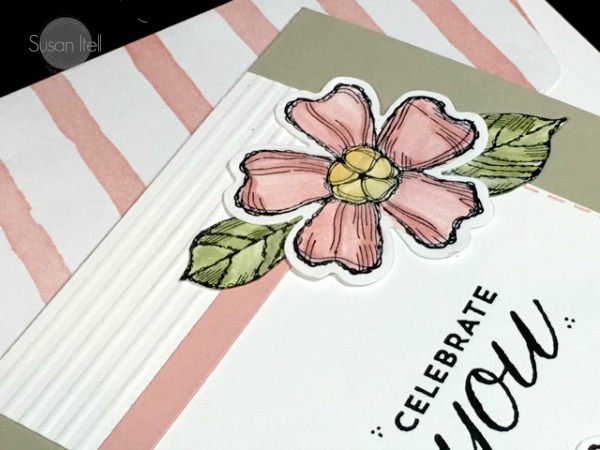
In the above photo do you see the strip of blushing bride? Pop back tomorrow as I will share with you the whys and hows. Because I felt that the white was off balance, I scored thin lines…..this is something that I like to do – fast , fun and effective!

The finale, a fun envelope! This paper is from the Birthday Bouquet from the Occasion Catalog – this is a beautiful collection of paper. I will say that I was NOT a fan of Sahara Sand when I first started stampin’…..but it is a great neutral color that makes other colors POP! I high;y encourage you to try it if you have not already used it!
The month is coming to a close and WOW, what a great month it has been. Sale-a-bration is the best time of the year for getting not only free goodies but also to take advantage of getting lots of free product with the started kit. Please feel free to email me and I would love to help you see that getting a discount is fun each and every day!
See you tomorrow…..it will be the stepped up version of today’s card….please share my love of paper crafting and positive energy with your family and friends….word of month and referrals are the best way to grow…..and I thank you in advance, until tomorrow!
Built for Free Using: My Stampin Blog

Beautiful card, Susan. I love the coloring and how it is made easy by the details of the stamps. Can’t wait to see tomorrow’s version.
Love this card! Beautiful coloring and composition….good job Susan!
Beautiful Spring bouquet and the colors are so soft! love the score lines on top….I always forget about doing that. Can’t wait for tomorrow’s version.
So pretty! I like your version better than the one in the catalog and can’t wait to see how you step it up!
Love the colors you used! I skimmed right over the version in the catalog but yours makes me want to CASE it.
Beautiful card. I see so many special “Susan” touches, score lines, dashes, dots. They add so much to the design. Looking forward to “step-up” version tomorrow.
Wow! What a beautiful, sweet card. I love the colors and the way you embellished the top section. I’m really liking this stamp set too. It may be a future purchase. I too am like you about aqua painters and blender pens. You have inspired me to give those guys a try. Have a great weekend!
So soft and pretty! I didn’t remember the one in the catalog. I love the score lines and that layer of pink you added to it. Your version is prettier though I do like the colors they used. There’s seems to be more mottled up or too busy. Now, please don’t tell me you created the one in the catalog too!
Dear Susan, This card is so pretty. I love the soft colors you chose. The scored lines on top with the pink layer is so pretty. The dots and dashes around the edges are so sweet. You add so much of you to your cards. I have this stamp set. I have not used it. Yet. Now you have inspired me to use it. I hope You do not mind if I case it. Great coloring. Coloring is so relaxing. I am so glad your snow is beginning to melt. Have a great weekend. Ellen Hinds
I love those neutrals with blushing bride and that green. This card ROCKS! I remember that about snow–once it melts everything is sloppy and muddy. Ugh. I’m sure that beats 3 freaking feet of snow though!